
Content
Got numbers? Data?
Let’s make them talk. The hard way! … or how to turn your data into information.
How?
Using data science and project management best practices.
Approach?
- Precisely define the project perimeter (features, resources, timeframe).
- Clearly define the question you want an answer for.
- Explicitly identify the target audience.
- Communicate. As much as possible.
Required steps?
Data preparation, involving cleaning, normalization, dealing with missing data, and so on…
Types of analysis?
- Descriptive analysis (summaries, tendencies, variability, regressions, …)
- Exploratory analysis (find relationships and connections, correlations, …)
- Inferential analysis (population estimation based on samples, modelling, …)
- Predictive analysis (based on historical data, modelling, …)
- Machine learning / AI (can be used for prediction, sentiment analysis, …)
Possible outcomes?
- Reports (full-fledged PDF’s, ready for publication).
- Dashboards (static or interactive).
- Online documents (reproducible research, interactive, with plots, and ability for the user to export the data or the plots).
- Data processing automation.
- Recommendations (points for future improvements, ie data governance).
Data visualization examples?
How to communicate complex data precisely and appropriately? The key point is to tell the user a story. Look at the selected examples below.
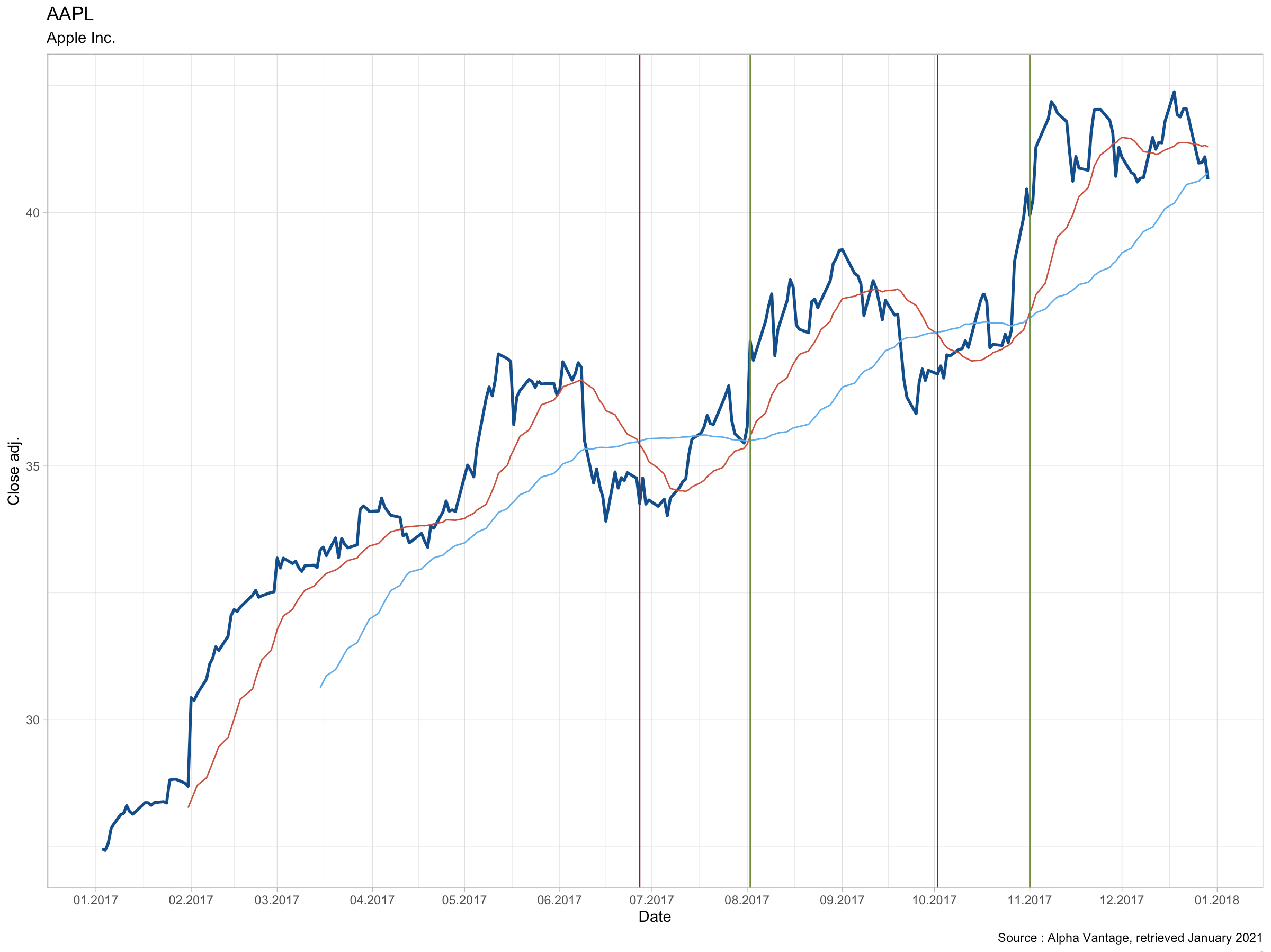
Time series
Rich plot showing financial data augmented with moving averages and signals. It is the result of a simple MACROSS simulation where the vertical bars indicate when to buy or sell a stock. This plot also highlights the need to tune the strategy.
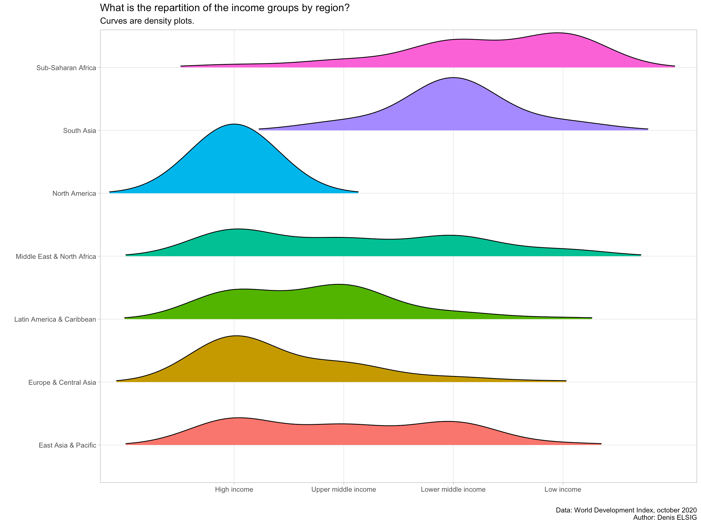
Ridges plot
Instead of using a bar plot, this ridges plot shows the density of categories allowing an immediate and clear visual comparison. The data comes from the World Bank and contains the income level for each country. It is aggregated by region.
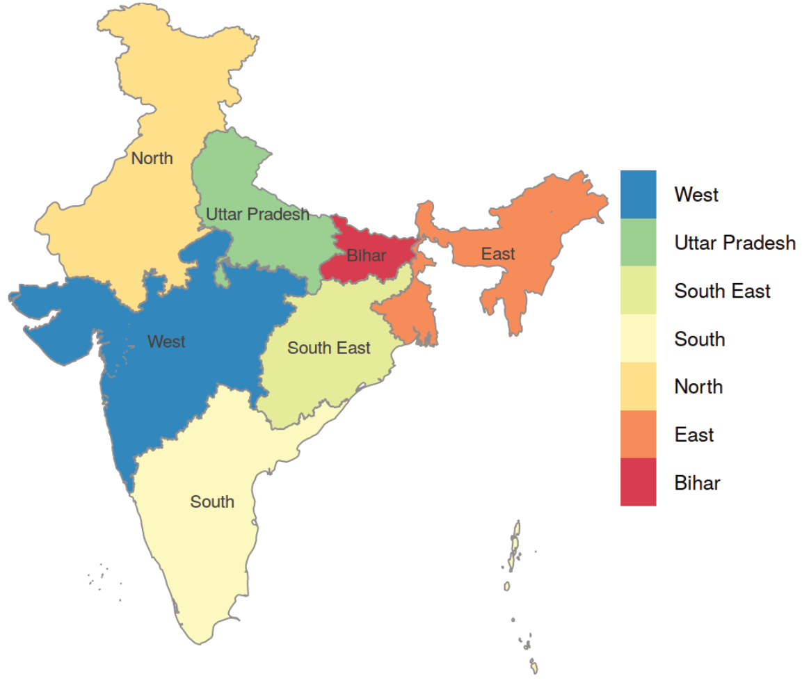
Geographical Information Systems (GIS)
This is a simple geographical map showing the main administrative regions of India. From a data scientist perspective, it’s special kind of plot.
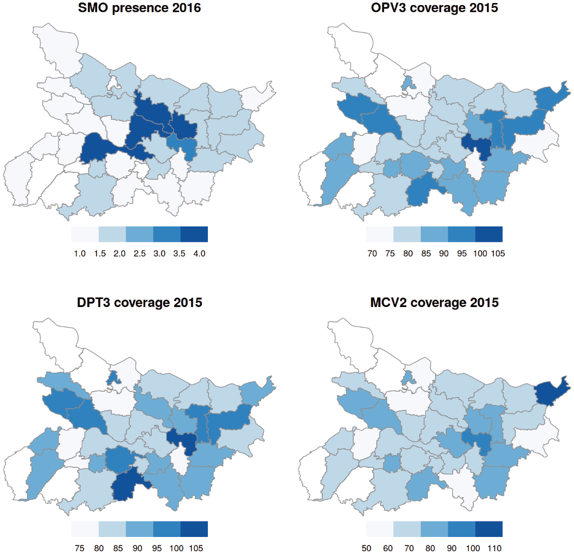
Below is a focus on the Bihar region, still in India. Here the plot contains 4 distinct maps, each with a more precise administrative level, showing where health personnel is located and 3 vaccines coverage. This is a powerful plot allowing to quickly grasp an overview of a complex situation regarding more than 100'000'000 inhabitants. Here, the data shown comes from the World Health Organization.
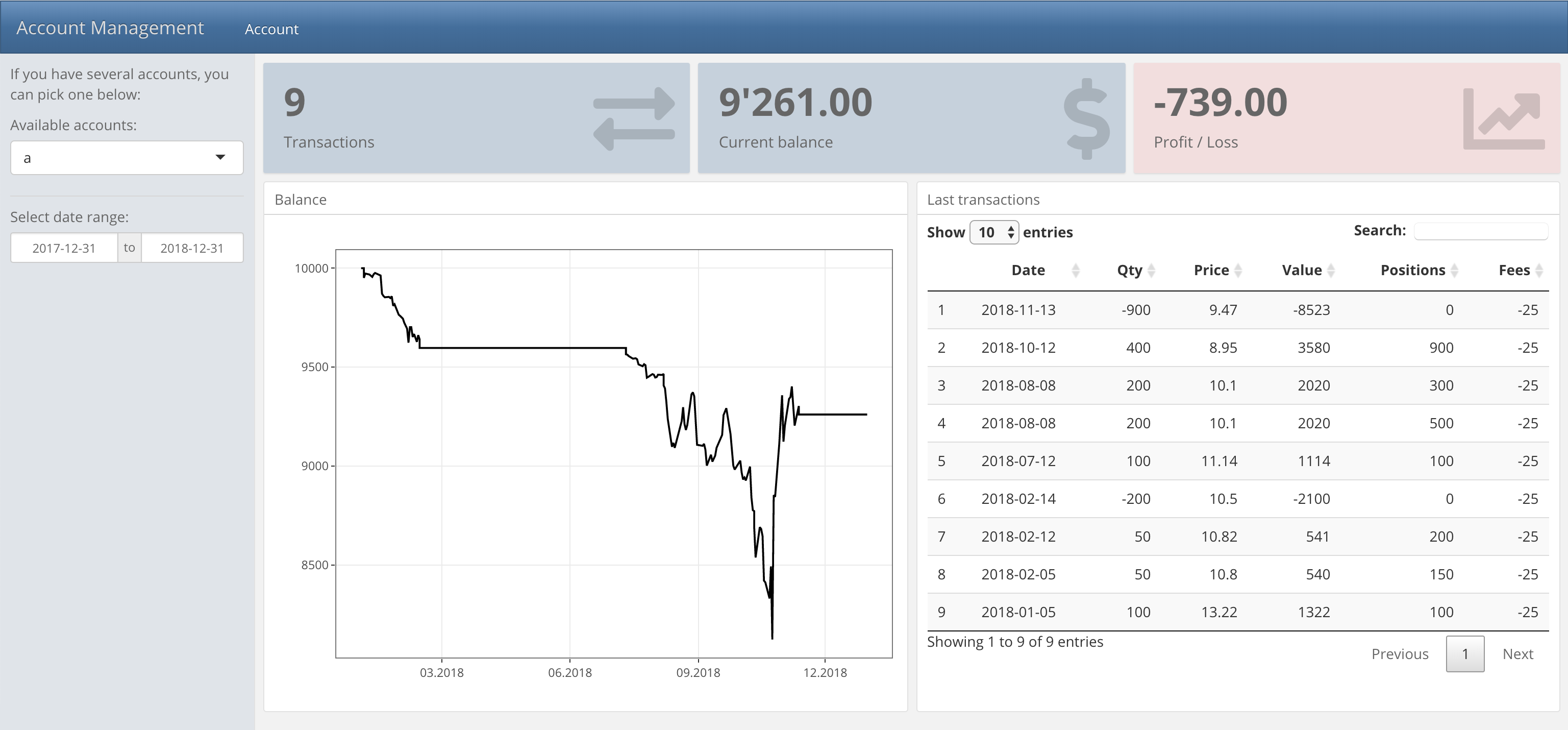
Interactive dashboards
Sometimes, interactivity is needed because:
- the data is dynamic or updated frequently,
- the data is complex, and an exploration tool would help to better understand it,
- there is a need to visually explore several scenarios.
This is where interactive dashboards are useful. They are small applications, usually web-based, created to answer specific and recurring questions.
The example below illustrates a bank account used for stock trading. It contains several portfolios, each having a specific investment strategy. The dashboard offers a quick summary, a plot and the last transactions. The user can select another portfolio to explore the result of each financial strategy.
Updated 04.04.2021